Overview
1 out of every 3 students in higher education is a first or second-gen immigrant or international student
- Higher Ed Immigration Portal
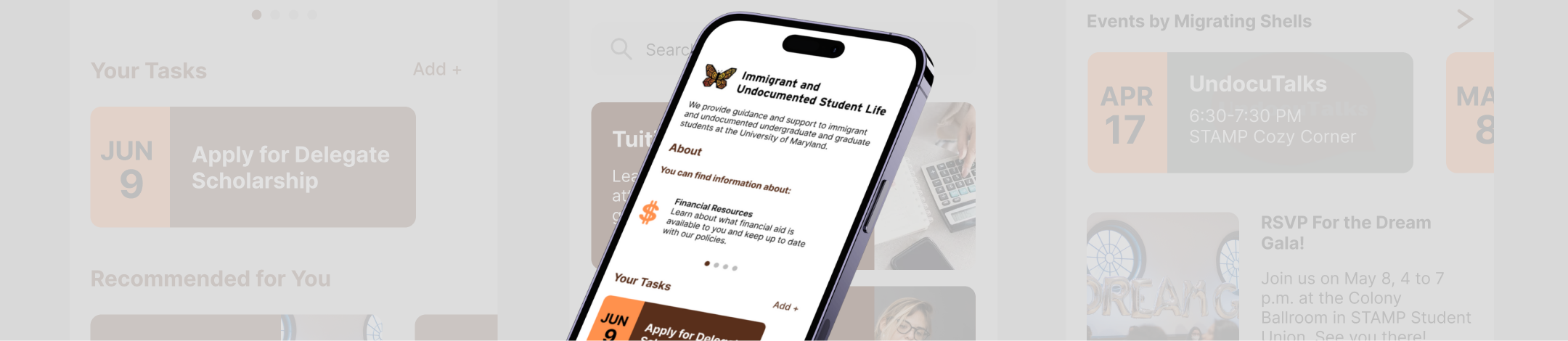
The Office of Immigrant & Undocumented Student Life (IUSL) is the University of Maryland’s answer to supporting this community. The office supports immigrant and undocumented students, called "UndocuTerps," through mentoring, social programming, and advocacy. Their website is a one stop shop for all information relevant to undocumented and immigrant student journey at UMD, but a lot of important resources get buried within each other and lead users away from the website. Uncertainty surrounding what the office has to offer is created as a result. The UndocuTerps app addresses this by streamlining access to the most important resources and information available to undocumented and immigrant students on and off campus.
Skip to Prototype
Defining the problem
Information overload and complex user flow leaves students confused
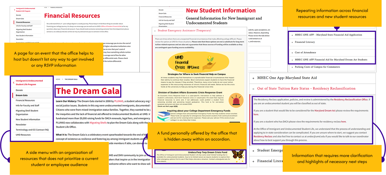
The office's website offers a wealth of resources but is not easily navigable. It is difficult to see what is possible.
Great amounts of information are buried under accordions, many of which lead to other tabs that take students away from the site. Having to open numerous accordions and having numerous tabs open cause information overload, leaving students perplexed as to how they can get involved with the organization and to how many resources that they have at their disposal.
Who are the users?
Students who need guidance on campus resources, finances, and community
Imagine you got accepted into the university of your choice, but you are considered out of state due to your status and have a big price tag for this upcoming semester. Maybe you have legal fees or legal obligations that are overwhelming you. Maybe you are just looking for people in a similar situation as you.
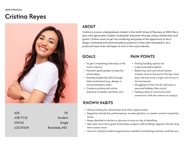
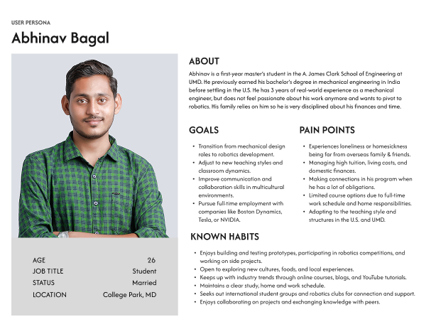
The primary users of the UndocuTerps app would be students that are immigrants or have undocumented status. Their college experience and the resources that they need to know differ than students with a different status. These personas encompass some of the needs that these students have due to various concerns like finances, student resources, and community.
Ideation and Wireframes
Brainstorming how students can tackle all of their concerns
So what can users do? Navigating a large university as a new, undocumented student could be overwhelming, especially financially as undocumented students are ineligible for financial aid and are enrolled as out-of-state. Learning about information from UndocuTerps when other resources are exhausted could relieve some of the stress. For users to find that info with ease, I can divide UndocuTerps' information in three components that meet their needs.
1
Choosing UMD Resources to Review and Visit
Users can find a variety of resources available to them that may help them financially or professionally.
2
Registering for Events or Organization Membership
Users can register for events from the office, the Dream Gala, the newsletter or Migrating Shells, a student organization.
3
Requesting Help from the Terp Dream Crisis Fund
Users can reach out to the office to see if they can receive small funding.
How can we visualize the UndocuTerps app experience?
I focused on three prominent purposes for the app's navigation. Each task has a different tab on the navigation bar. The home screen could lead to Resources, Events, or the Terp Dream Crisis Fund (or Fund for short), but so would the nav bar. From Resources, users can find financial support. From Events, users can join Migrating Shells, see their events, or RSVP for the Dream Gala. From Fund, users can fill out a form to apply for the office's Terp Dream Crisis Fund.
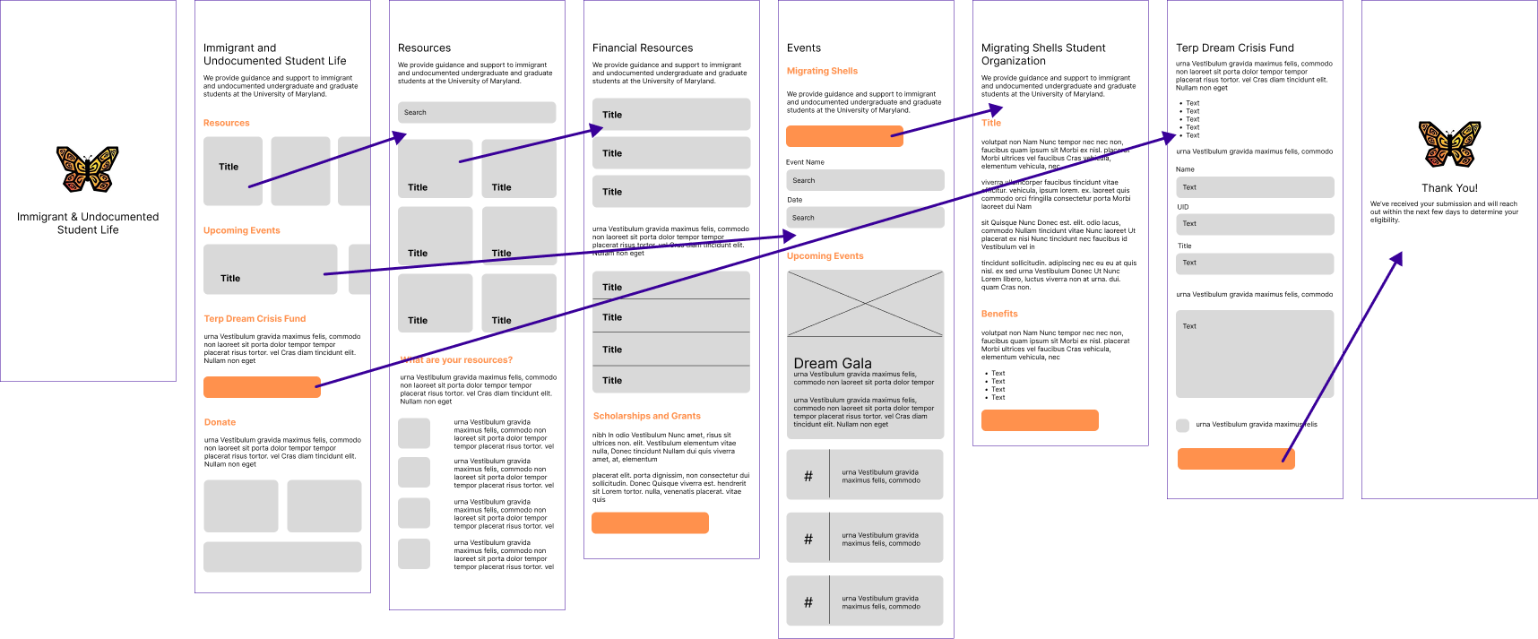
Screens in order: Loading, Home, Resources (Nav), Financial Resources, Events (Nav), Migrating Shells, Fund (Nav), Thank You.
Designing the solution
Creating a consistent system for clarity and cohesion
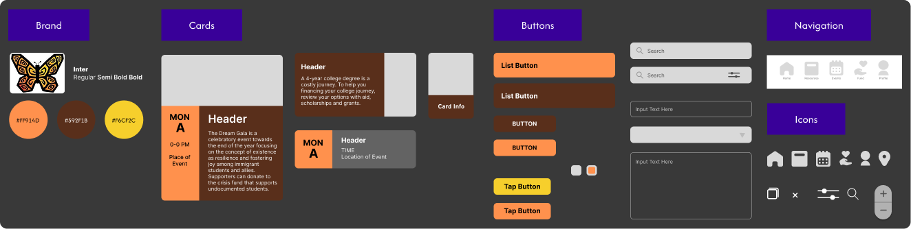
For the first high-fidelity prototype, I took inspiration from the Immigrant and Undocumented Student Life office’s website and branding. The office’s logo is a multicolor butterfly of yellow and orange. I decided to take these colors along with brown for the app’s branding and style.
From there, the design system utilizes roundedness across all components to portray friendliness to students.
How can we create task flows encompassing immigrant/undocumented student needs?
Main Screens
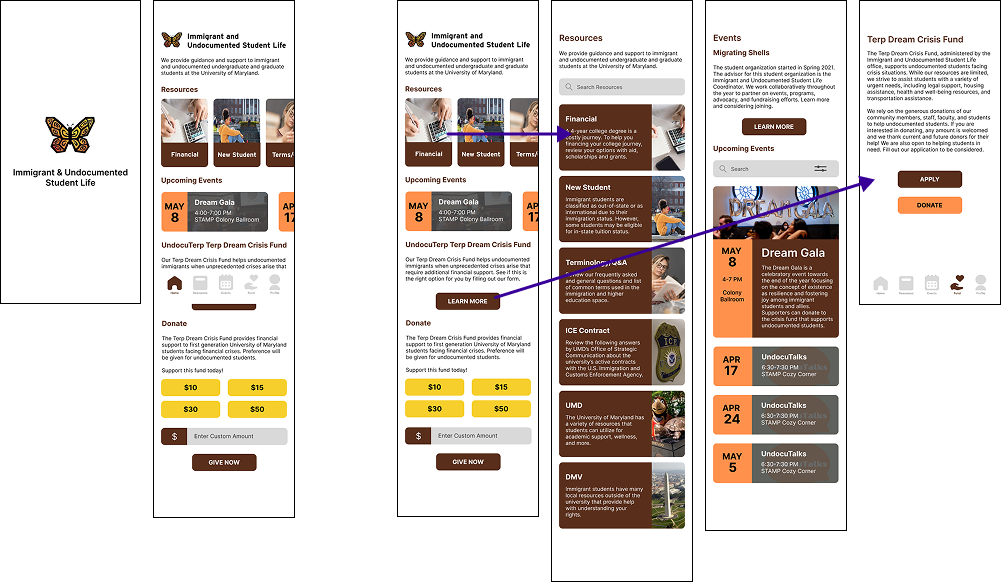
The main navigation leads to different task flows that all relate back to user needs. Home leads to the three main functions. (Home, Resources, Events, Fund).
Resources Task Flow
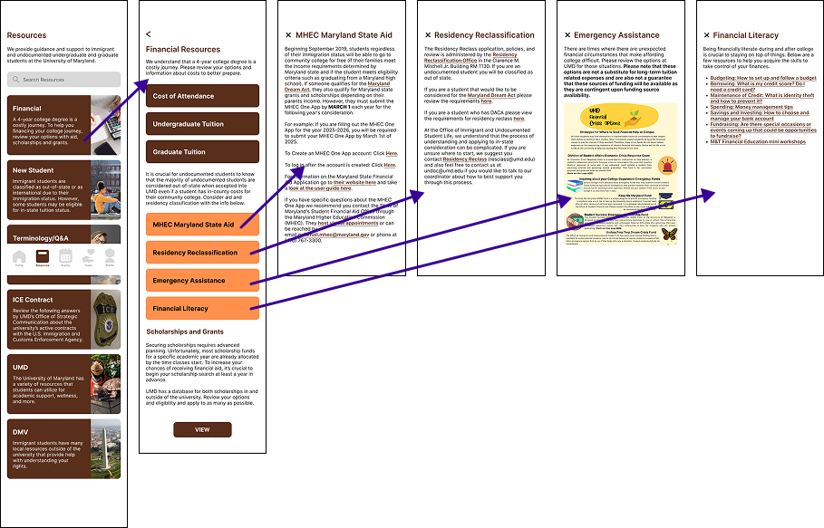
Most resources are not offered by UndocuTerps. In the app, there are cards to separate resources from what UndocuTerps can provide.
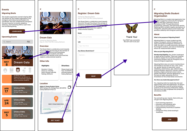
Events Task Flow
Major events that UndocuTerps help provide to students are in connection with Migrating Shells and the Dream Gala. This task flow allows users to engage in social initiatives.
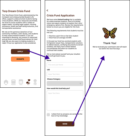
Fund Task Flow
The office’s internal fund is hidden on the website. By giving it its own section and an applying function, this task reduces emails while bringing the fund out of obscurity.
Usability Testing
But Is It Usable? - Testing how the prototype meets user needs
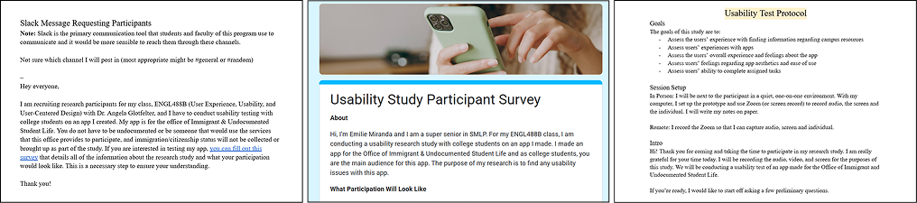
The next phase for this app was to conduct usability testing; however, before that I needed to find participants and write the script and guidelines for the usability test protocol. Given the context of the app, I made sure to let potential participants know that their status was not a matter of discussion and any student in University of Maryland was welcome to test the app.
The results are in: findings across 5 participants
From recruitment, I was able to find 5 participants to take part of the usability study for the UndocuTerps app. Over the course of these five sessions, I found various usability issues, some recurring or noticeable with one user. The most apparent usability issue impacted or lead to the other usability issues. Based on my findings, I wrote a usability report outlining the concerns and revised my prototype of the UndocuTerps app.
Context
The usability testing of the mobile app included pre-test and post-test questions, held in person and online, all with screen and audio recorded with transcripts. Participants were asked to use the think aloud protocol during select tasks surrounding the app’s core functions. After engaging with the tasks, participants were asked about their overall experience and impressions of the app.
Main Usability Issue
Users struggle to complete tasks that are unrelated to the Resources tab and screen, communicating a mismatch of user needs and expectations
The simple solution to all usability issues would be to place them in an area of the app that aligned with user expectations, but it would ignore a larger usability issue. Based on users’ behaviors, the resources section and screen are the most helpful to the user. Based on this, the rest of the app needs to reflect what serves users’ needs.
Redesign: Navigation Bar (+ Main Screens in App)
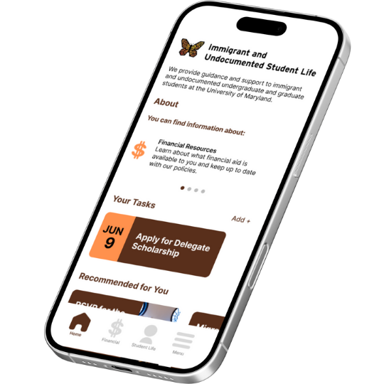
The nav bar has changed to expand upon the resources section and has combined resources and fund as “Financial.” “Events” has expanded to “Student Life.”
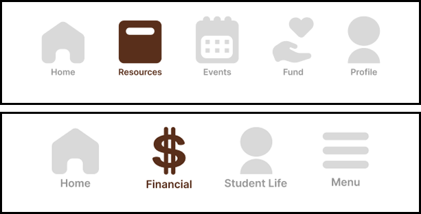
Part of the solution to the wider usability issue is changing the navigation bar to highlight the most important resource for students: financial. The Events screen becomes Student Life to help Migrating Shells and Dream Gala coexist as both are directly related to the office, but do not have enough importance alone to justify there being an “Events” or “Club” screen in navigation. The resources that are less involved with the office or need more detail (website) are with the hamburger menu.
Redesign: Adding a Hamburger Menu
The nav bar has a hamburger menu that helps users navigate to areas within the app and to access outside links. Information outside of the scope for the app goes here.
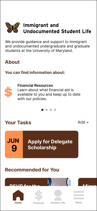
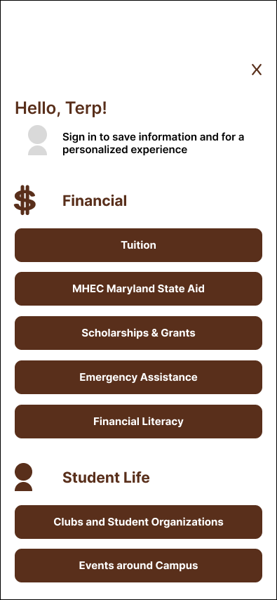
To add onto the revised navigation bar and redesigned screens and subsequent task flows, the solution to the wider usability issue includes a hamburger menu in the navigation bar. This menu has the plethora of resources within the app and that the website provides. Some buttons link to information also needs to be explained in depth with more screen room, better suited for the original website and beyond.
Redesign: Visual Design Improvements + Expanded User Capabilities
One user pointed out that the app was text-heavy and while others did not point it out, it was clear that it fatigued them. The redesign also allows for users feel control through new capabilites.
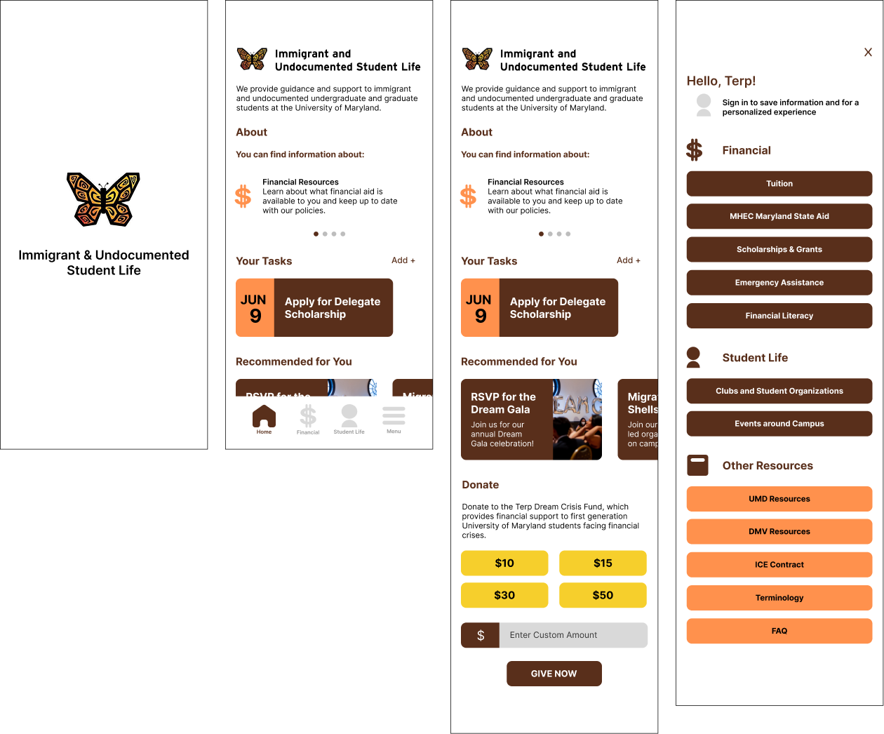
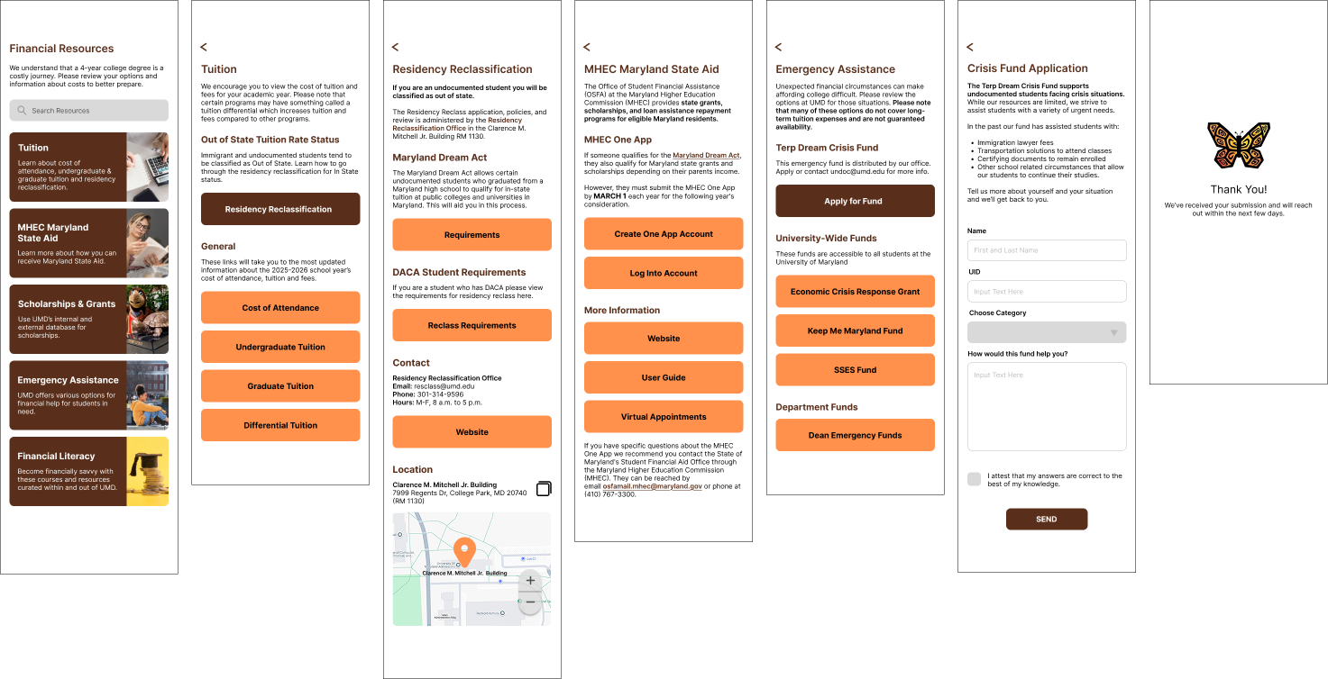
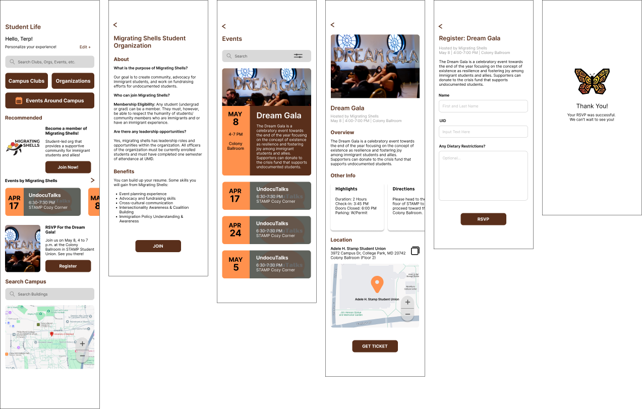
Besides these main redesigns, I improved other task flows that are expanded upon in my usability report.
Read Usability Report
Redesigned Prototype
The Culmination of User Feedback: Final UndocuTerps App
As a result of the usability testing and the usability report, I made great changes to the UndocuTerps app, or the app for the Immigrant and Undocumented Student Life office, to improve its usability and to ensure that it meets user needs. The prototype below is the culmination of this project:
The Impact
The UndocuTerps connects students with resources they didn't know existed
1
100% of users would recommend this app
"I would use it because...I think it'd be really helpful to pass this on to individuals that I know that are going to college, or that plan on going to college."
2
100% of users felt comfortable with the app's visual design
"It just feels like the app gives me warm hugs. It gives me that type of style."
3
80% of users would use this app again
"I would because I myself could use the resources that the app has to offer. And it was, again, really easy to navigate."
Next Steps
Reflecting on this experience
This was a very rewarding and challenging project to work on. Making an app based on a pre-existing website, I realized that I fell into some pitfalls when transferring the important information like bombarding the user with too much text (text that would be easier to navigate through the web, though mobile size not so much).
Upon realizing that and finding out what usability issues I had unintentionally created by trying to highlight certain information, I put a lot of effort into redesigning the app to meet user needs.
I realized through testing that the users were telling me what they thought the app was communicating was important. I knew that changing the task flow to move certain tasks around would not change the fundamental problem: Resources was the one-stop-shop for all tasks.
Being part of this process helped me see the bigger picture when encountering usability issues. I wish that I was able to do more usability testing to see if this new version would have had a better success rate.