Overview
"For 30 years and counting, Yahoo has become second nature for millions of people around the world. The Internet is always changing, but our
mission to be your trusted guide through it all never will."
- Yahoo Inc
Yahoo has been a staple of the internet for decades. As the web expanded and became increasingly complicated, Yahoo’s mission was to be “a trusted guide through it all”. It compiled key headlines and articles from sources around the internet, and presented users with a one stop shop to stay updated and glance through the internet. The platform was meant to feel comfortable, reliable and convenient. In addition to its content, Yahoo’s bright colors and quirky branding distinguishes it as a more friendly and approachable site than its competitors.
Skip to Prototypes
Defining the problem
Inconsistent design across main pages clash with the brand and mission of Yahoo
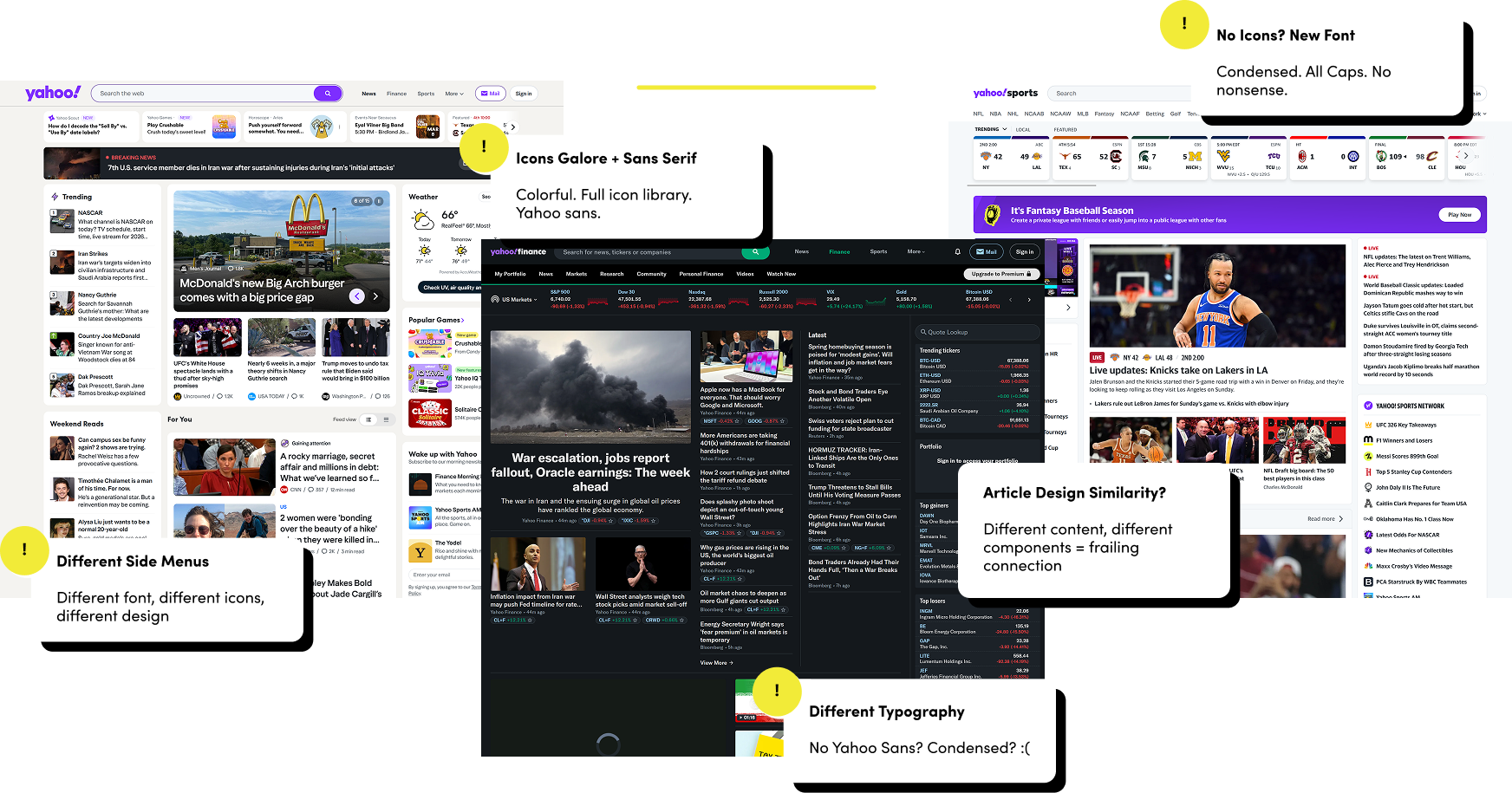
Over time, Yahoo struggled to keep up with modern UI. It also expanded and added new sites, which made the overarching platform feel increasingly disjointed. We identified several key issues across the news, finance, and sports pages.
1
Inconsistent Visual Design
Pages have distinct typography, colors, layouts, and branding.
2
Overcrowded & Confusing
The structure is complicated, and takes time to understand.
3
Un-engaging Endless List Scroll
The endless list scroll does not effectively utilize the larger screen space available.
These problems have led to Yahoo losing user trust, and slowly drifting away from its original purpose.
What's our goal?
Comfortable, Reliable, Convenient...and Consistent
We want to...
Redesign Yahoo to feel more polished, reliable, and consistent - all while sticking to its original purpose of being a comfortable place on the web.
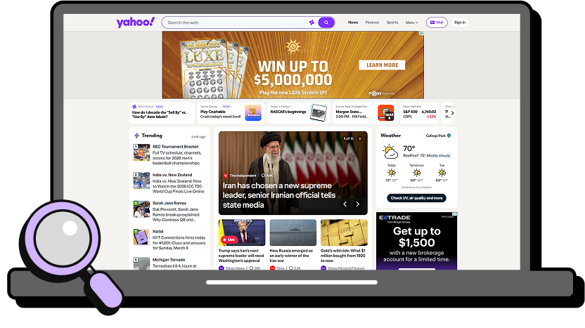
We believe that Yahoo has the potential to occupy a unique space on the internet. Its mission to comfort is incredibly relevant, at a time where media and news consumption can feel overwhelming. Its colorful, more playful branding could make the experience more grounded and human, standing apart from the modern minimalistic, sterile look of large conglomerates.
Moodboard
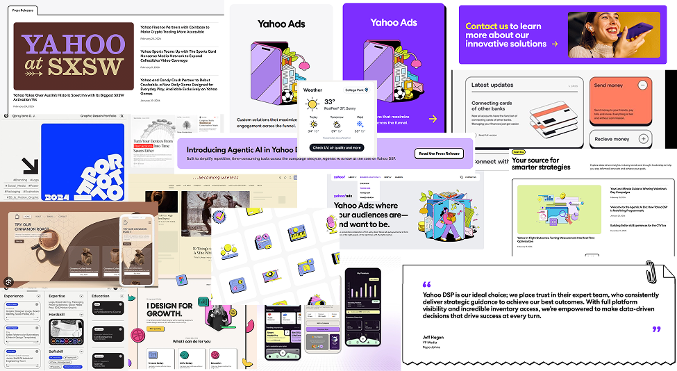
We Were Inspired by...Yahoo? And Neo-brutalism
We didn’t change the formula. Yahoo had all the ingredients — sprinkled all around News, but not so much anywhere else. Yahoo’s company site had an intriguing Neo-Brutalist theme that no page on regular Yahoo could match with fun interactions and pastel colors.
Our Design Challenge
One word: Balance
Our challenge was to redesign Yahoo News, Finance, and Sports pages to have sophisticated layouts and clean navigation, maintaining credibility, while thoughtfully adding touches of Yahoo’s quirky and playful branding.
What is a designer to do?
Our Solution
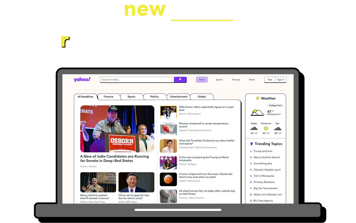
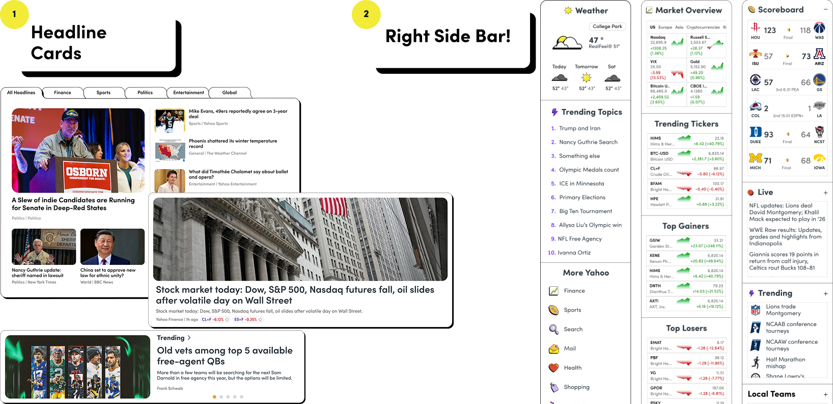
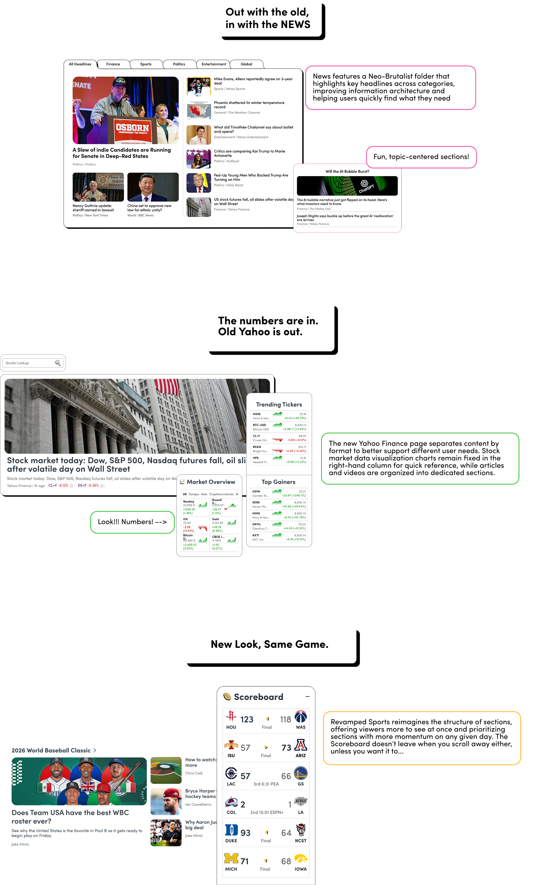
Our redesign prioritizes Consistency...
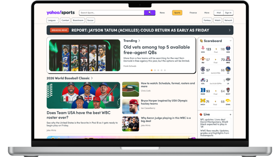
All the New pages feature headline cards and a right side bar...
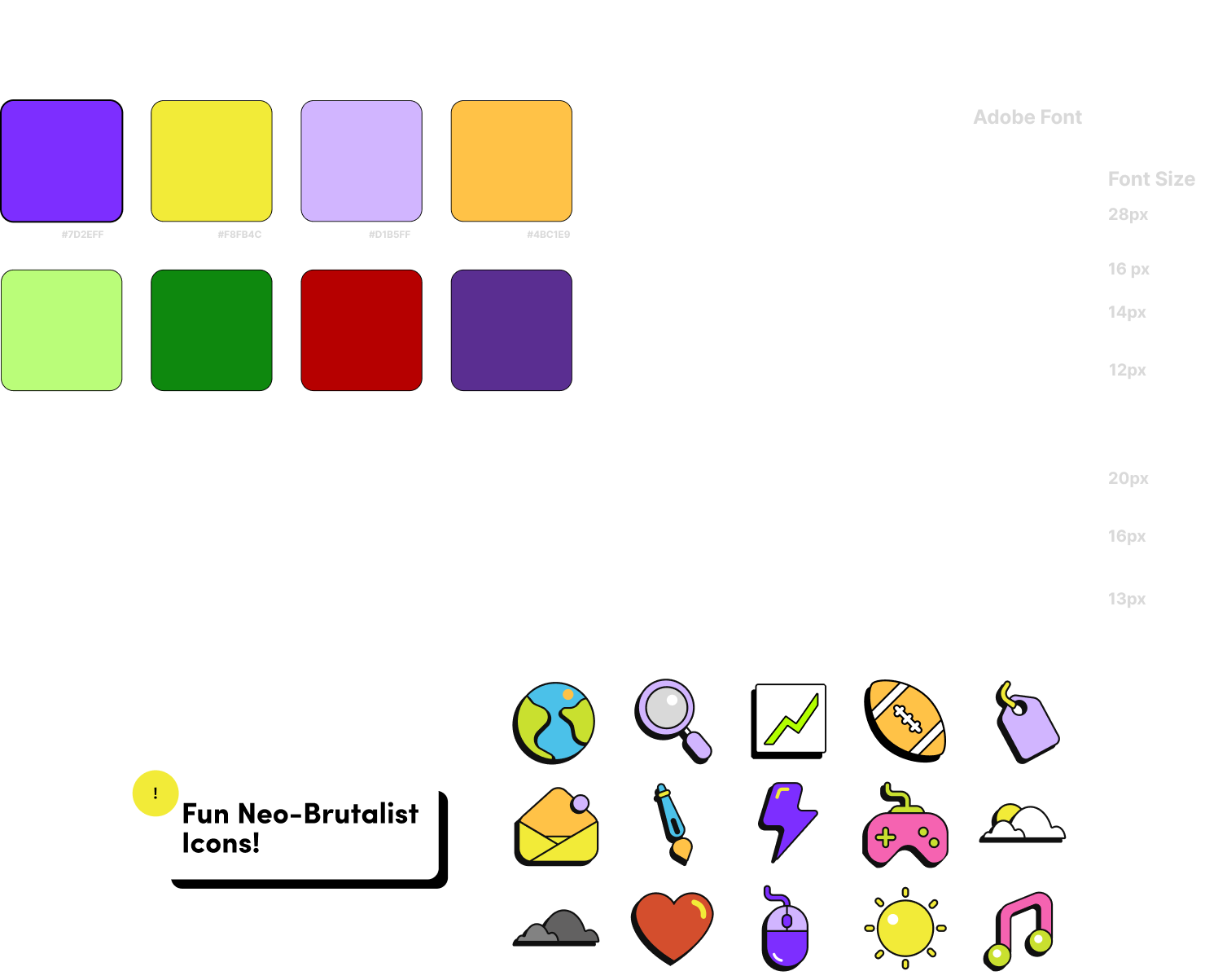
And a Cohesive Design System that Emphasizes Comfort
We brought back and standardized the Yahoo brand’s iconic color palette, having pops of bright color add a playful feel to an otherwise clean and modern UI. Meanwhile our font is our Typeface, Sofia Pro, is comforting and easy to read, aligning with the Yahoo’s key prinicples.
You’ve seen what makes our pages consistent. Now lets look at what makes them Unique
We brought back and standardized the Yahoo brand’s iconic color palette, having pops of bright color add a playful feel to an otherwise clean and modern UI. Meanwhile our font is our Typeface, Sofia Pro, is comforting and easy to read, aligning with the Yahoo’s key prinicples.
Prototype
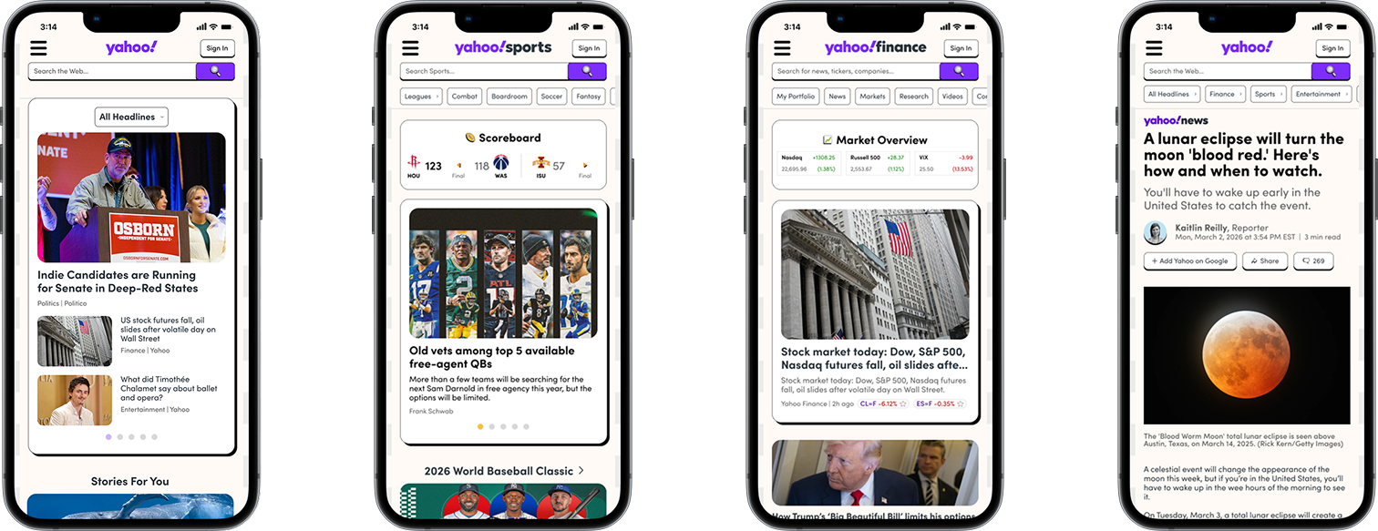
New Yahoo also adapts to mobile breakpoints
Check it out for yourself
Prototype
It's Still the Most Trusted Guide through the Internet
Next Steps
Reflecting on redesigning the Yahoo
Take Risks
Yahoo is not an easy platform to redesign. My group didn't know what we were getting into when we landed on Yahoo, but we quickly figured out what Yahoo's designers' dilemmas were in designing for multiple audiences.
Communicate, Communicate
Working in this group of three to design something as huge as Yahoo, it was easy to fall into inconsistencies. I found our progression and best work came from sitting down together and working out quirks with our designs. A balance of remote and in-person was necessary.